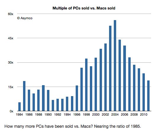
This chart shows that the ratio has fallen back to level not seen since the mid-90s. A very important note, is that this chart only shows PCs vs. Macs, actual full-fledged computers that Apple doesn't really sell that much of. Another fact is that if the chart included iPhones and iPads, which given the constantly blurred lines of "what is a PC", the chart would be much more interesting.
Source: TweakTown