Posted on Tuesday, July 17 2012 @ 19:49 CEST by Thomas De Maesschalck
The Register had some quality time with Office 2013 and published a report about the productivity suite's new Metro UI, you can read it
over here. Overall the site concludes the new Metro UI is definitely not an improvement.
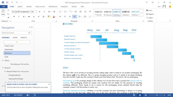
Most of the translucent effects and gradients that were present in Office 2010's Ribbon menus have been removed. In their place are simple, flat fields in white and solid colors.
The enhanced File menu, which was called the "Backstage View" in Office 2010, now looks like a full-fledged Metro app. It takes over the entire screen with a minimalistic, touch-friendly UI.
When launched, each application presents a gallery of possible document styles with large, friendly previews, as if you could just choose one and your document would already be made for you.